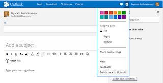
The new monochromatic interface looks nice, but was there a necessity to depart from the normal email user interface? It is true, Outlook.com is more integrated with Skydrive, the Office programs, Facebook etc. The previous interface had everything visible on the email web page.
It was intuitive to find neither the Office programs nor the Skydrive. What was less intuitive was writing the email itself.
* The TO field comes as a detached box with some contacts.
* You have to click to Add the SUBJECT line.
* The attachments gets organized to a DOCUMENTS folder (I need to read some documentation).
The FedEx guy to whom I had sent an attachment could not locate it. I had to use their computer (-$5.45) to find the document in my SENT folder, etc.
* Finding Skydrive and Office items were not intuitive either. You need to hover over the Outlook lable at the top
to reveal a drop-down which will then reveal the icons for MAIL, PEOPLE, CALENDAR and SKYDRIVE as shown.
* The SAVE DRAFT should have been automatic.
However, if you want to revert to the Hotmail interface you can do it. This is good till you get used to the new interface.
This being a Preview will get better in the final product. For Microsoft to beat up Google they have to bring the advertisements along side. Another nice feature would have been the ability to scribe the email in a language of your choice.


2 comments:
Finding Skydrive and Office items not intuitive? What are you comparing to? Finding and navigating Google's features, like Documents and Calendar, is a train wreck. Getting them to work the way you want to is even worse. Microsoft is ahead of the game here.
I entirely agree with you. Google's stuff is getting worse and worse. Too many notes.
There are lots o things Microsoft does right. I don't believe every new version should have a new interface. i cannot put it better than Microsoft 'Content before chrome'
Post a Comment